Tables and Data Management
This guide covers FlowForger Portal's Dataverse table features in the Data Model group of the sidebar: browsing tables, managing records in a full CRUD grid, editing a table's saved views, browsing and creating columns, and working with global choices (option sets). ER diagrams are covered in ERD Editor.
Tables Browser
Navigate to Data Model → Tables to view all Dataverse tables in your selected environment.
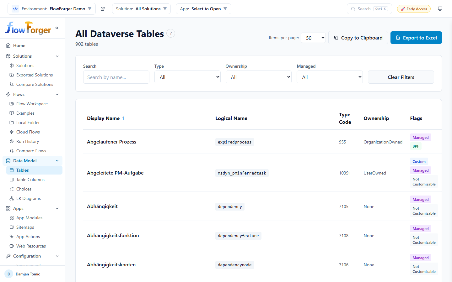 The Tables browser showing a filterable list of all Dataverse tables
Table View
The Tables browser displays tables in a sortable data table with the following columns:
- Display Name -- The user-friendly name of the table (links to the Table Details page)
- Logical Name -- The system name shown in a code-styled badge
- Type Code -- The numeric object type code for the table
- Ownership -- Whether the table is UserOwned, OrganizationOwned, etc.
- Flags -- Color-coded badges indicating table properties:
- Custom (blue) -- Created by a user or solution, not a built-in system table
- Managed (purple) -- Part of a managed solution
- BPF (green) -- Business Process Flow table
- Activity (orange) -- Activity table
- Not Customizable (gray) -- Cannot be customized
Filters
The filter bar across the top provides five controls:
- Search -- Free-text search by display name or logical name
- Type -- Filter by All, Custom, or System tables
- Ownership -- Dropdown populated from the ownership types present in your data (e.g., UserOwned, OrganizationOwned)
- Managed -- Filter by All, Managed, or Unmanaged
- Clear Filters -- Resets all filters to their defaults
Filter selections are remembered in your browser, so they survive page navigation and browser refreshes.
Solution Filtering
When a solution is selected in the top header, the Tables page shows only tables that belong to that solution. The page title changes to reflect this, for example "Tables in My Solution."
Export
The table can be exported to the clipboard or Excel. Exported data includes the Display Name, Logical Name, Type Code, Ownership, and Flags columns.
Pagination
Results are paginated with configurable page sizes: 10, 25, 50, 100, or 200 items per page.
Table Details
Click any table name in the Tables browser to open its details page, a full record management interface.
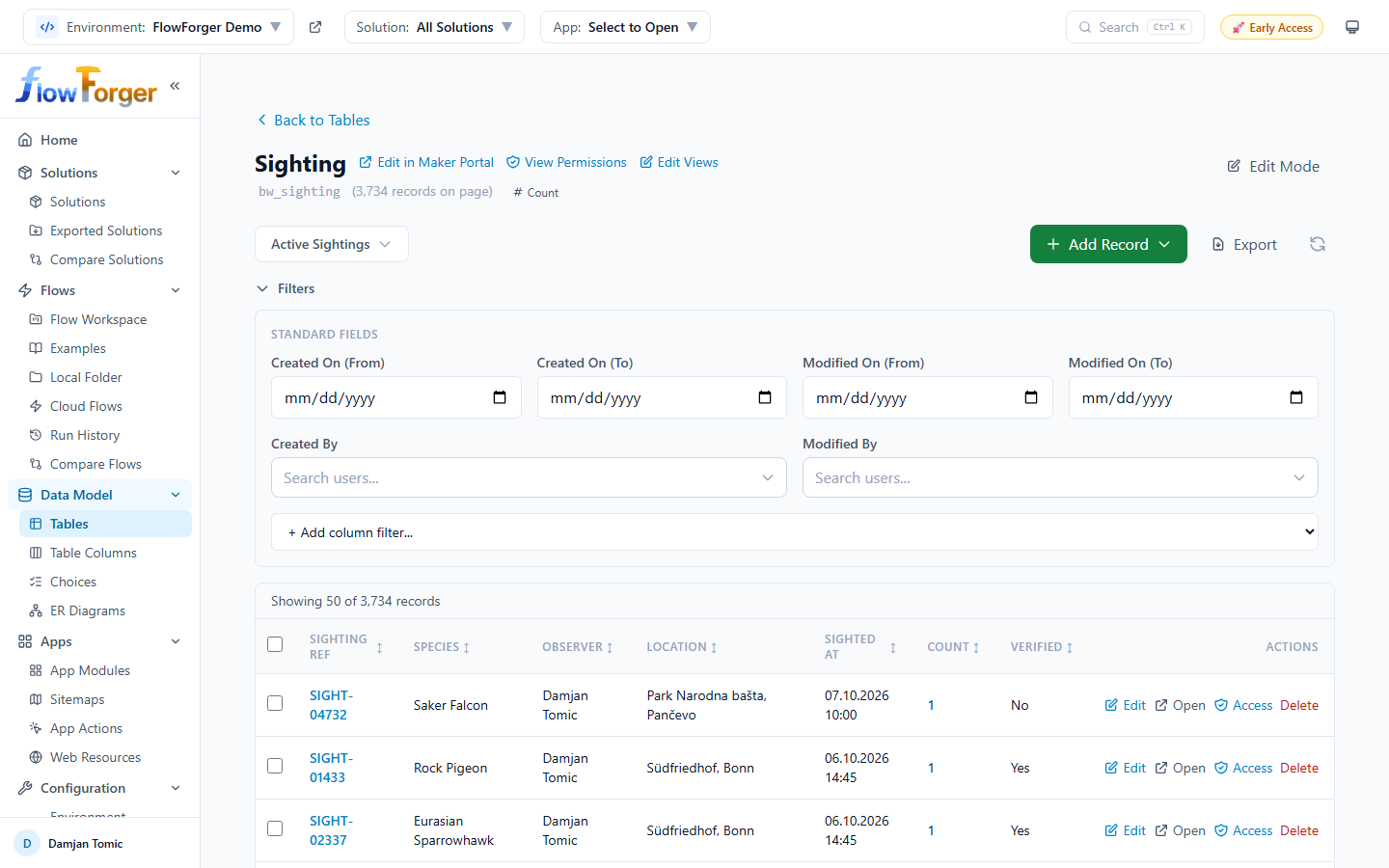 The Table Details page showing the record grid for a selected table
Header
The header displays:
- Back to Tables link to return to the Tables browser
- Table display name with the logical name shown underneath in a code badge
- Edit in Maker Portal -- Opens the table in the Power Apps maker portal for the current environment and solution
- View Permissions -- Opens the table's Table Access matrix
- Edit Views -- Opens the View Editor for this table's saved views
- SharePoint Library -- Opens the table's SharePoint document library. Shown only when document management is set up for the table.
- Record count -- Shows how many records are on the current page, e.g. "(50 records on page)". Click Count to get the exact total number of records in the table; the result shows the total and when it was checked.
- Edit Mode toggle button -- Switches the grid to inline editing mode
View Selector
The view selector sits below the header and controls which columns and filters are applied to the record grid.
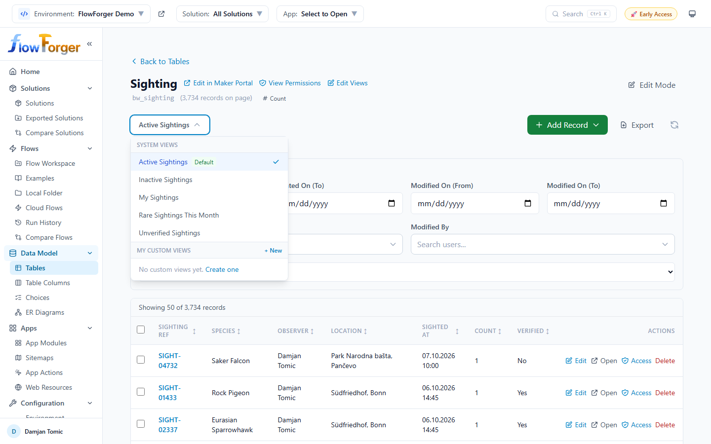 The view selector with system views and custom views
- System Views -- The table's saved views from Dataverse (e.g., "Active Accounts"), with Default and Managed badges. They use their FetchXML for server-side filtering. To change a system view itself, use Edit Views.
- My Custom Views -- Views you define yourself, stored in your browser. You can create, edit, and delete them.
To create a custom view:
- Open the view selector dropdown
- Click + New next to My Custom Views (or Create one when you have none yet)
- Choose columns, a default sort, and an optional OData filter
- Save the view with a name
The selected view is remembered per table.
Custom View Editor
The Create Custom View / Edit Custom View modal lets you configure:
- View name -- A descriptive name for the view
- Columns -- Pick from all available table columns, with a search box
- Default sort -- A column and direction, or No default sort
- Filter expression -- Optional OData filter string (e.g.,
statecode eq 0 and createdon gt 2024-01-01)
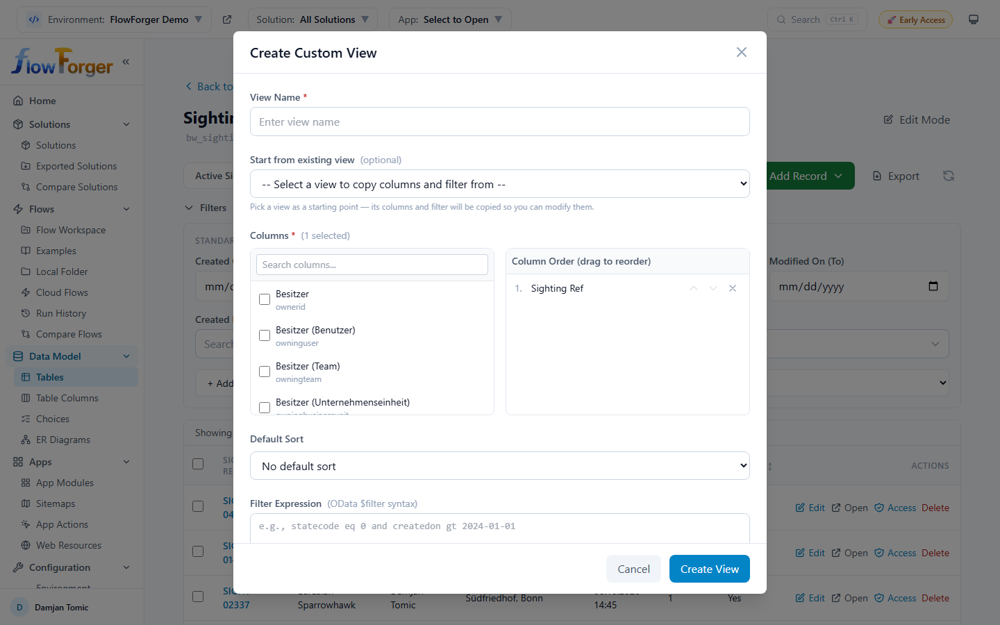 The Custom View Editor with column picker and filter configuration
Record Grid
The record grid is the centerpiece of the Table Details page, showing records in a spreadsheet-like interface.
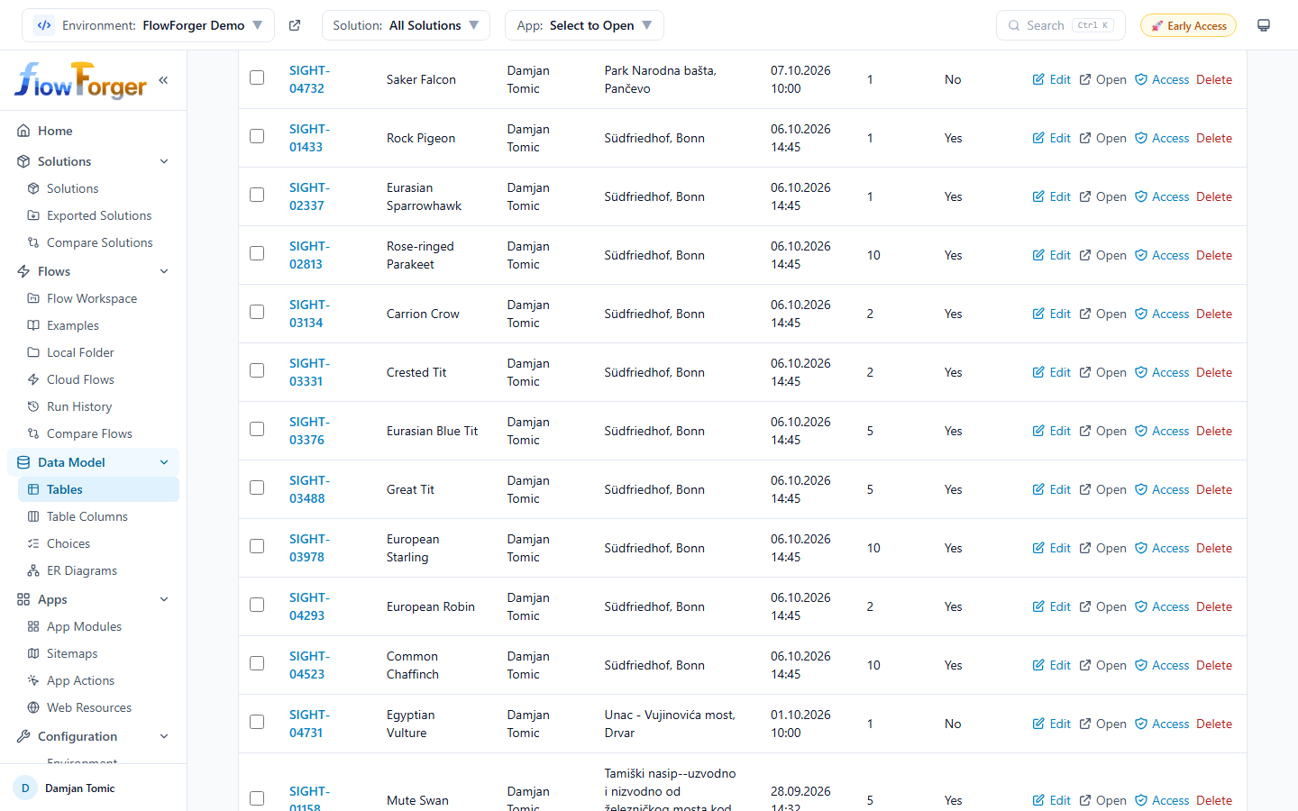 The record grid displaying Dataverse records with sortable columns
Features:
- Sortable columns -- Click column headers to sort ascending/descending
- Row selection -- Checkboxes on each row for selecting records (for bulk operations)
- Select all -- Checkbox in the header to select/deselect all visible records
- Row actions -- Each row has:
- Edit -- Opens the record in the form modal
- Open -- Opens the record in Dataverse
- Docs -- Opens the record's SharePoint folder (shown when document management is enabled for the table). If the record has no folder yet, a Create SharePoint Folder dialog offers to create one, named after the column you pick under Folder name from column.
- Access -- Opens the Record Access dialog
- Delete -- Deletes the record after a confirmation
Checking Access for a Record
Click Access on a row to open the Record Access dialog for that record:
- Shared With -- Every user and team the record is shared with, with their access rights
- Check Specific User -- Search for a user by name, email, or domain to see which access rights (Read, Write, Append, AppendTo, Create, Delete, Share, Assign) that user has on this record, and why
Inline Editing
Toggle Edit Mode using the button in the top right to enable inline cell editing.
- Click Edit Mode to enter editing state
- Click any cell to modify its value
- Modified cells are tracked and highlighted
- A yellow banner shows the count of unsaved changes with a Discard all option
- Click Save Changes to save all modifications to Dataverse
- Click Cancel to discard changes and exit edit mode
Tip: The save button shows a badge with the number of modified records so you can track your changes at a glance.
Adding Records
The Add Record dropdown button provides three ways to create new records:
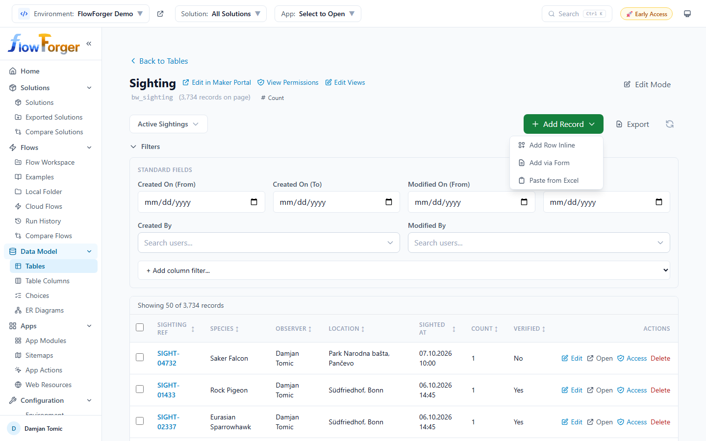 The Add Record dropdown with three options
- Add Row Inline -- Adds a new editable row directly in the grid. Fill in the fields and save.
- Add via Form -- Opens a modal form with the table's columns. Supports form selection (system forms from Dataverse or your local forms).
- Paste from Excel -- Opens a modal where you paste tab-separated data copied from Excel or another spreadsheet. Choose whether the first row contains column headers, and an Import mode:
- Create new -- Every pasted row becomes a new record.
- Upsert -- Rows are matched on the chosen Match column; a new record is created when there is no match.
- Update only -- Rows are matched on the chosen column; rows without a match are skipped.
Record Form Modal
The form modal is used for both creating and editing records. It supports:
- Form selector -- Choose from Dataverse system forms or your local forms
- Form layout -- System forms render with their tab/section structure when available
- All columns mode -- Without a form selected, all writable columns are displayed
- Local form editor -- Create and manage local form layouts stored in your browser
- Lookup picker -- For lookup fields, a search-and-select picker is provided
- Size -- Switch between normal, large, and maximized
- Record info -- When editing an existing record, a read-only strip shows Created, Created by, Modified, and Modified by
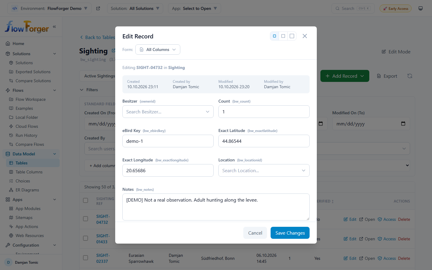 The record form modal showing a structured form layout
Local Form Editor
The Local Form Editor (Create Local Form / Edit Local Form) lets you create form layouts that are stored in your browser. These forms control which fields appear and in what order when creating or editing records.
- Create new local forms, optionally with Copy from System Form to start from a Dataverse form's columns
- Reorder columns with the move up/down buttons, or remove them
- Select from all available table columns, with a search box
Deleting Records
Records can be deleted individually or in bulk:
- Single delete -- Click Delete on any row. A confirmation dialog appears.
- Bulk delete -- Select multiple records using the checkboxes, then click Delete Selected (N). A confirmation dialog shows the count, and a progress bar runs during deletion.
When document management is enabled for the table, selecting records also shows Create SP Folders (N), which creates the missing SharePoint folders for all selected records.
Record Filters
Below the view selector, a filter bar lets you add filters on top of the current view.
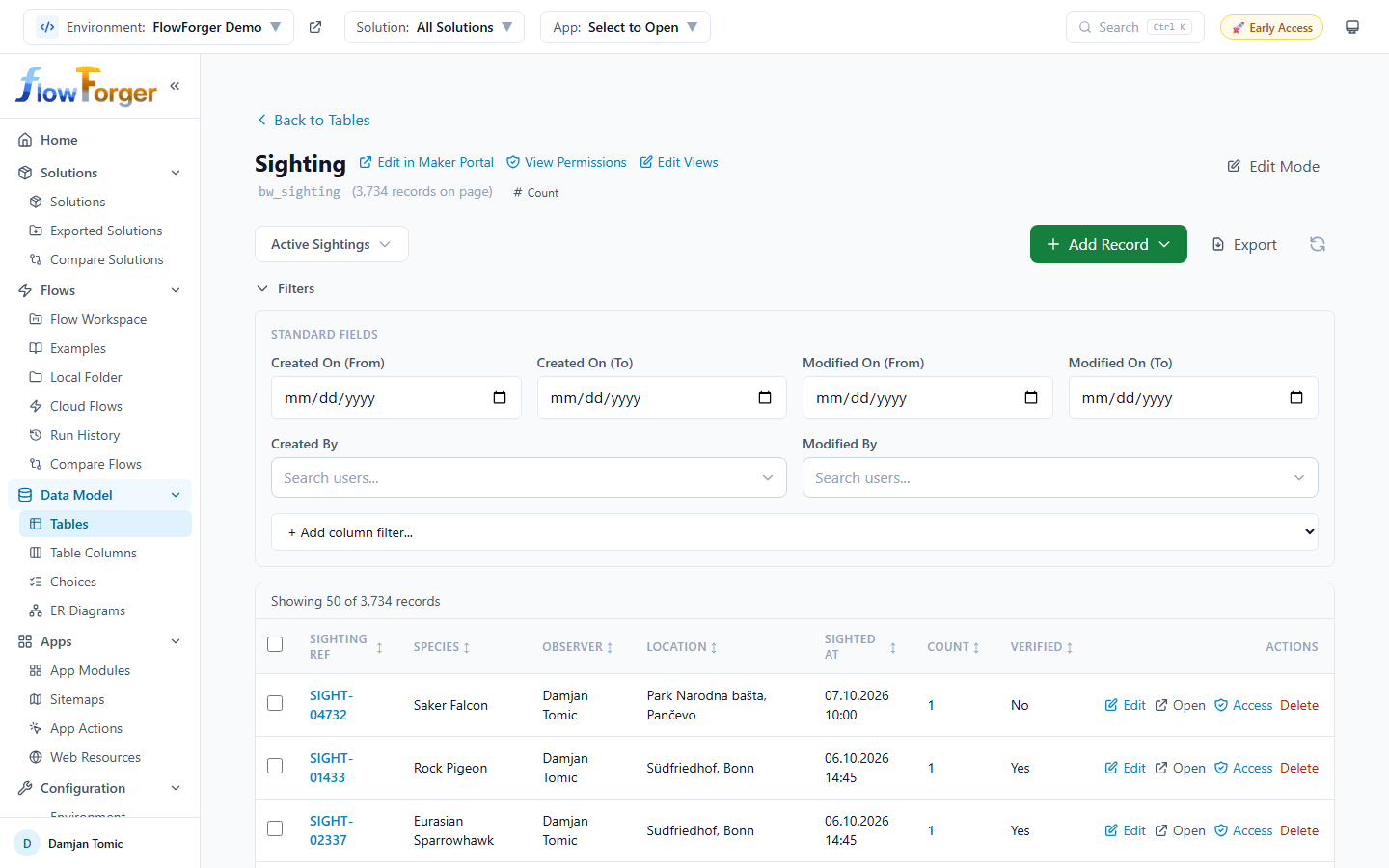 Column-level filters applied to the record grid
- Standard Fields -- Created On (From/To), Modified On (From/To), Created By, and Modified By (user search)
- Column Filters -- Pick a column under + Add column filter...; the available operators depend on the column's data type
Filter state is remembered per table.
Export to Excel
Click Export in the toolbar to export the currently displayed records to an Excel (.xlsx) file. The export includes:
- All visible columns with their display names as headers
- Formatted values (dates, lookups, and choices resolved to labels)
- Auto-sized column widths
- A timestamped filename (e.g.,
account_2026-02-07T10-30-00.xlsx)
Pagination
The bottom bar provides pagination controls:
- Rows per page selector (25, 50, 100, 250)
- Previous / Next buttons
- Current page indicator
View Editor
Click Edit Views on a table's details page to open the View Editor, where you edit the FetchXML and LayoutXML of the table's saved views directly.
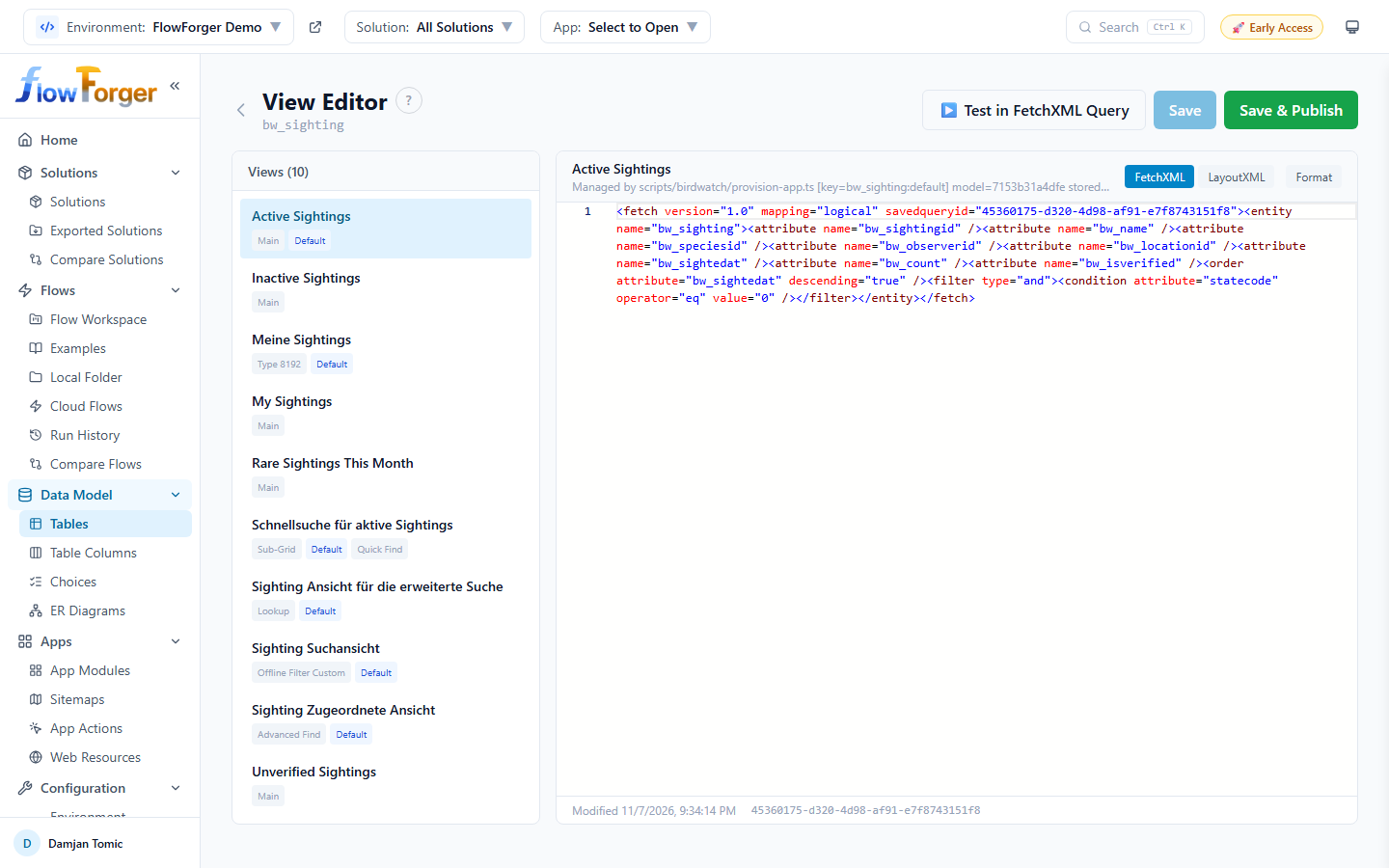 The View Editor with the view list on the left and the FetchXML tab open
- View list -- On the left, every saved view of the table with badges for its type, Default, Quick Find, and Managed. A view with unsaved changes is marked, and the header counts how many views have unsaved changes.
- Editor -- On the right, the selected view's name and description, and two tabs: FetchXML and LayoutXML. Format (Shift+Alt+F) formats the XML. The footer shows when the view was last modified and its ID.
- ▶ Test in FetchXML Query -- Opens the current FetchXML in the FetchXML Query console so you can run it.
- Save -- Saves the selected view to Dataverse. FetchXML and LayoutXML must be well-formed; if the FetchXML queries a different table than the view belongs to, you are asked to confirm, since that would break the view. A ✓ Saved badge confirms the save.
- Save & Publish -- Saves the view, then publishes the table so apps pick up the change.
Note: Saving a managed view creates an unmanaged customization layer on top of it, which can complicate future solution upgrades. The editor shows a warning for managed views.
Table Columns Browser
Navigate to Data Model → Table Columns for a column browser that lets you explore column definitions of any table in the environment.
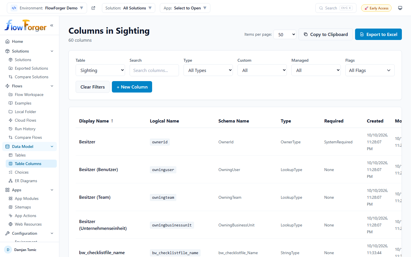 The Table Columns browser showing column definitions for a selected table
Getting Started
- Select a table from the Table dropdown
- The page loads all column definitions for that table
Column Information
Each column row displays:
- Display Name -- The user-friendly column name
- Logical Name -- The system column name in a code badge
- Schema Name -- The schema-level name
- Type -- The column type (e.g., StringType, LookupType, IntegerType, DateTimeType)
- Required -- The required level (None, SystemRequired, ApplicationRequired)
- Created / Modified -- When the column was created and last modified
- Flags -- Color-coded badges:
- Custom (blue) -- User-created column
- Managed (purple) -- Part of a managed solution
- Primary ID (green) -- The table's primary key column
- Primary Name (yellow) -- The table's primary name column
- Read-Only (gray) -- Cannot be updated
Filters
The filter bar provides six controls:
- Table -- Select which table to view columns for
- Search -- Free-text search by display name, logical name, or schema name
- Type -- Filter by column type (populated from the loaded data)
- Custom -- Filter by All, Custom, or System columns
- Managed -- Filter by All, Managed, or Unmanaged
- Flags -- Multi-select dropdown to filter by flags (Custom, Managed, Primary ID, Primary Name, Read-Only)
Editing and Deleting Columns
Click the edit icon on a column row to open the Column Edit Modal. For managed columns, it opens in read-only view mode.
Custom, unmanaged columns that are not the primary ID or primary name column also have a delete icon, which opens a Delete Column confirmation.
Creating a Column
Click + New Column to open the New Column modal for the selected table.
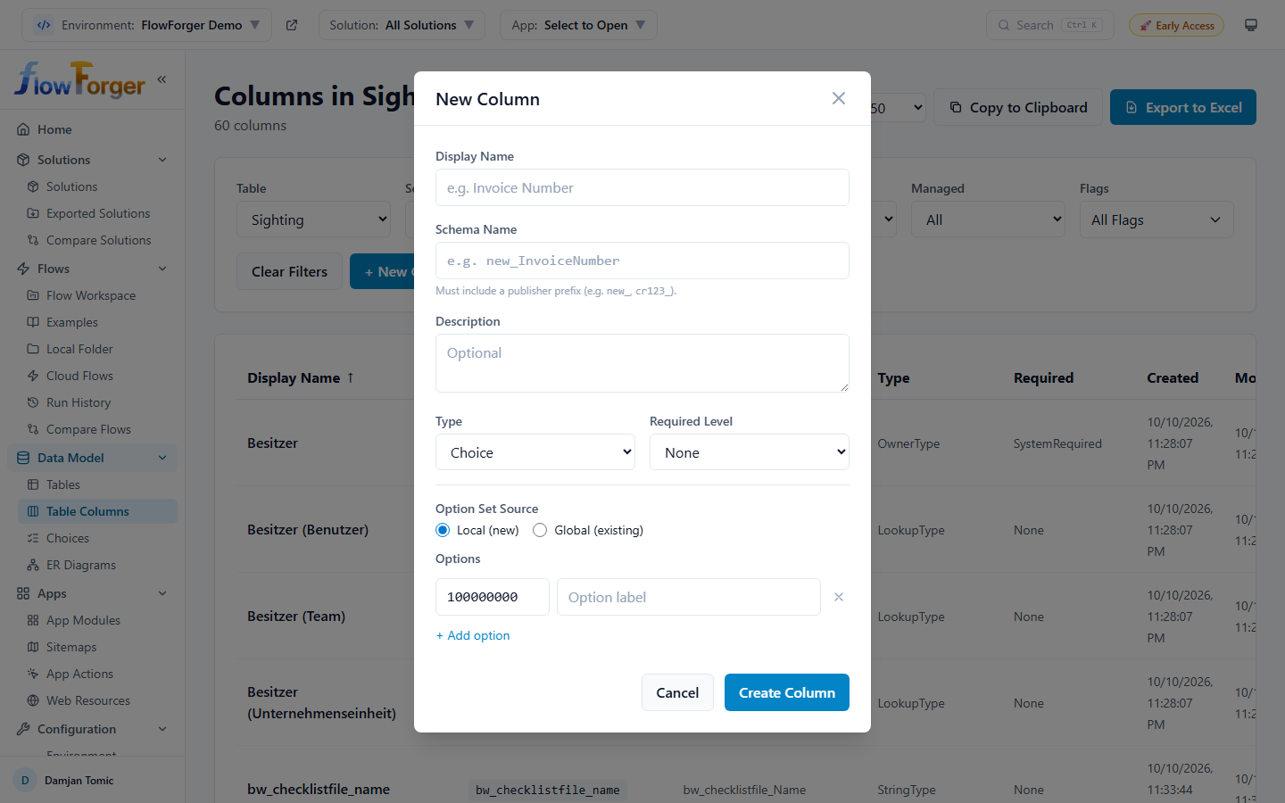 Creating a Choice column with local options
- Display Name and Schema Name -- The schema name must include a publisher prefix (e.g.,
new_InvoiceNumber). - Description (optional)
- Type -- Single Line of Text, Multiple Lines of Text, Whole Number, Decimal Number, Float Number, Currency, Yes/No, Date and Time, Choice, or Lookup
- Required Level -- None, Recommended, or Required
- Type-specific settings:
- Text: Format (Text, Email, URL, Phone, Ticker Symbol) and Max Length
- Numbers and currency: Min Value, Max Value, and Precision (decimal places) where it applies
- Date and Time: Format (Date Only or Date and Time)
- Choice: Option Set Source -- Local (new) with your own options, or Global (existing) to use an existing global choice
- Lookup: Target Table and an optional Relationship Schema Name (generated when left blank)
Click Create Column to create it.
Export
Columns can be exported to the clipboard or Excel.
Choices (Global Option Sets)
Navigate to Data Model → Choices to browse and manage global choices (global option sets).
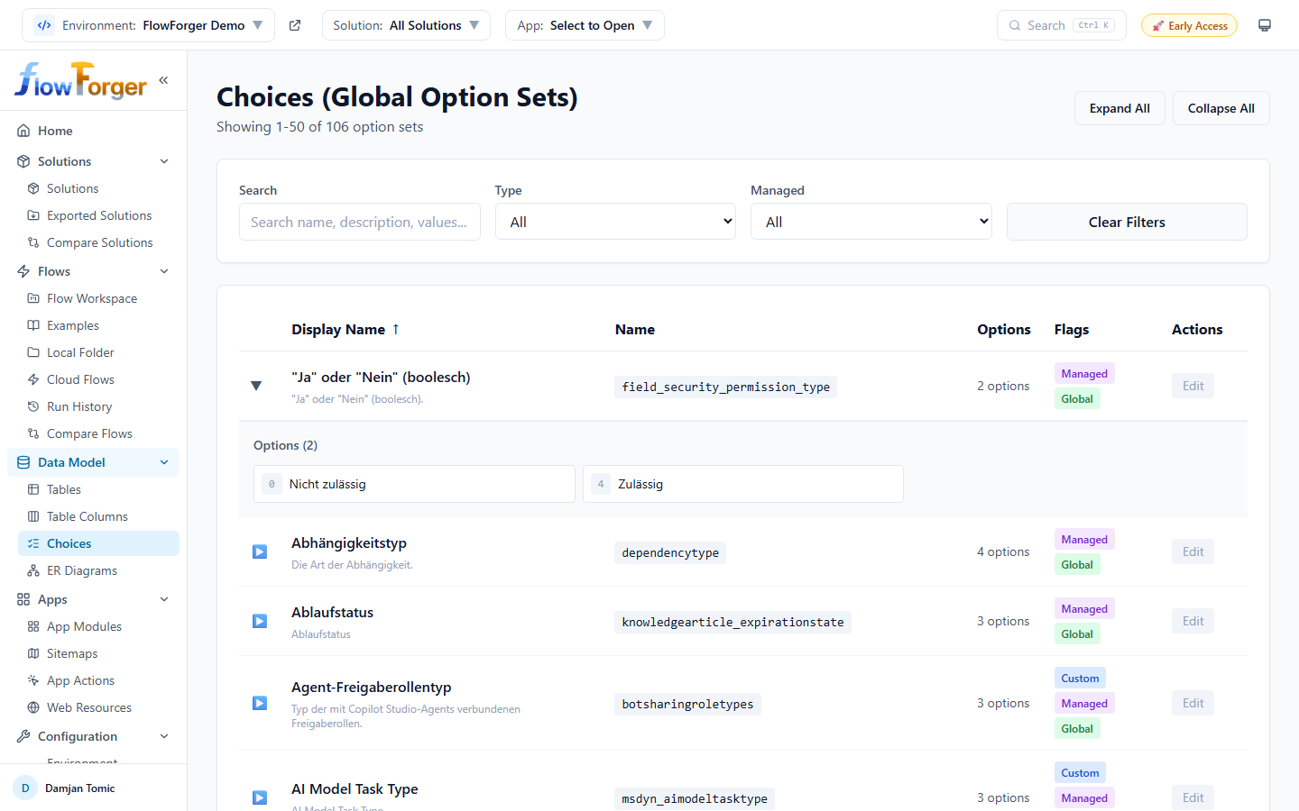 The Choices browser with expandable option values
Overview
Global choices define reusable option lists that can be shared across multiple tables and columns. The Choices (Global Option Sets) page displays them in an expandable table.
Table Columns
- Display Name -- The choice's display name with optional description shown below
- Name -- The system name in a code badge
- Options -- Count of option values (e.g., "5 options")
- Flags -- Color-coded badges:
- Custom (blue) -- User-created choice
- Managed (purple) -- Part of a managed solution
- Global (green) -- Available globally across tables
- Actions -- Edit button (disabled for managed choices)
Expanding Option Values
Click any row to expand it and see all option values in a grid layout. Each option shows:
- Numeric value -- The integer value stored in the database
- Label -- The display text for the option
- Color swatch -- If the option has an assigned color, a small color indicator is shown
Controls
- Expand All / Collapse All buttons in the header to toggle all rows at once
- Sortable columns -- Click Display Name, Name, or Options count to sort
- Pagination with configurable items per page (10, 25, 50, 100, 200) and first/previous/next/last page navigation
Filters
- Search -- Searches across name, display name, description, and option labels
- Type -- All, Custom, or System
- Managed -- All, Managed, or Unmanaged
- Clear Filters -- Resets all filters
Editing Choices
Click Edit on an unmanaged choice to open the Edit Option Set modal. Managed choices cannot be edited (the button is disabled with a tooltip explaining why).
The edit modal lets you:
- Change the display name and description
- Change option labels and descriptions
- Reorder options (move up/down)
- Delete options
- Add new options under Add New Option
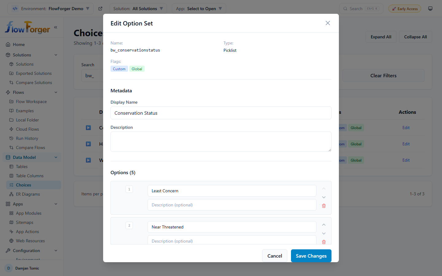 The Edit Option Set modal for adding and reordering options
Solution Filtering
Like other pages, when a solution is selected in the header, only choices belonging to that solution are shown.
Tips and Best Practices
Tip: Use the Table Columns browser to quickly find columns of a specific type in a table, such as all Lookup columns.
Tip: Custom views and local forms are stored in your browser. If you clear your browser data, they are lost, and they are not available on other devices. Note down complex view configurations.
Tip: When pasting from Excel, make sure your column headers match the logical names or display names of the target table's columns for automatic mapping.
Tip: The record grid supports editing multiple records at once in edit mode. Make all your changes, then save them in a single batch.