Home Dashboard and Layout
This page documents the FlowForger application layout, including the home dashboard, top header bar, sidebar navigation, and user menu.
Application Layout
FlowForger uses a three-part layout:
- Top Header -- A horizontal bar at the top with environment, solution, and app selectors, plus search, the early access badge, and the theme toggle.
- Sidebar -- A vertical navigation panel on the left with collapsible groups.
- Main Content Area -- The central area where page content is displayed.
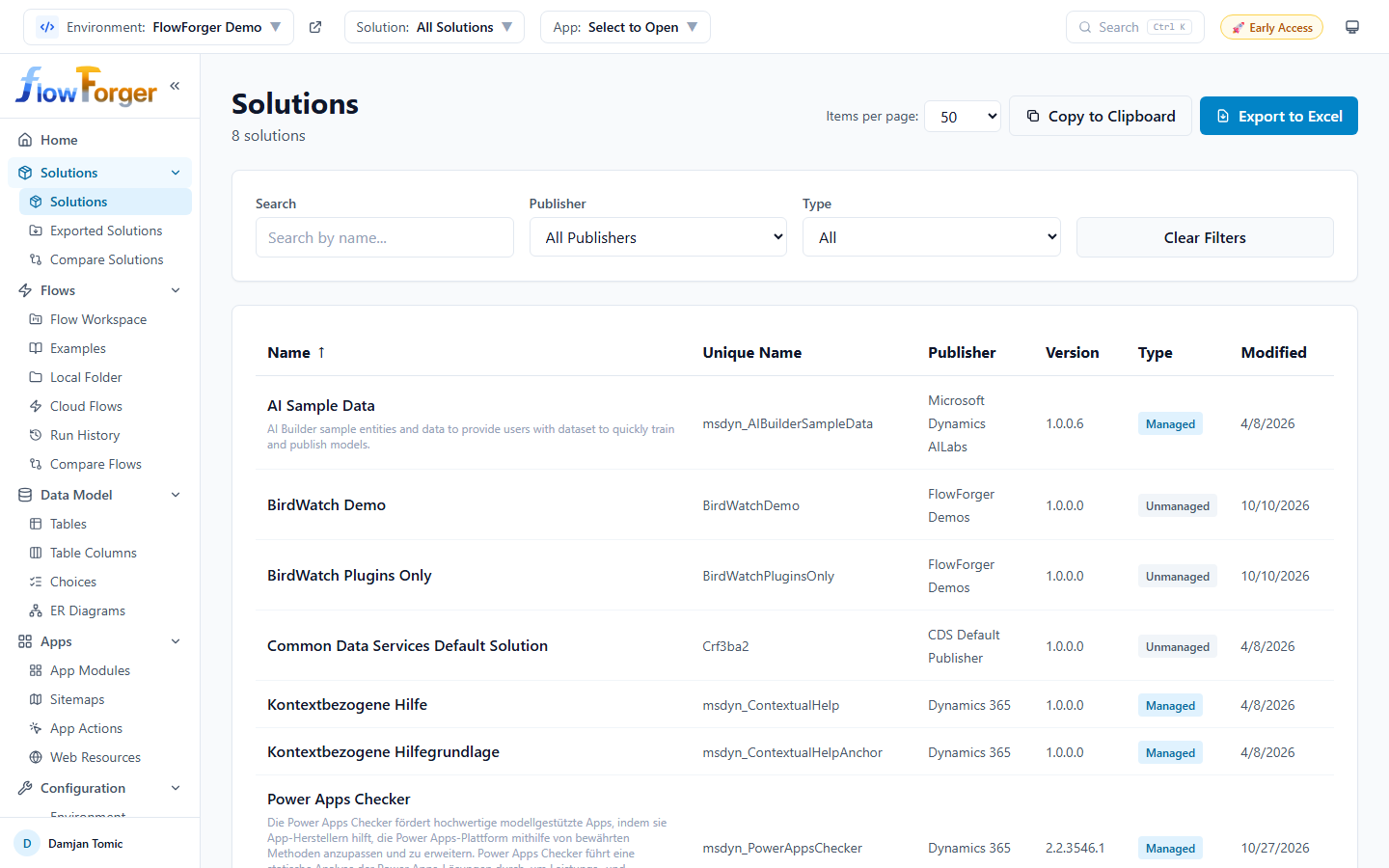 The FlowForger application layout with the top header, sidebar navigation, and main content area
Top Header
The top header is a fixed bar at the top of the application. On the left are three dropdown selectors that control which environment, solution, and application you are working with. On the right are Search, the Early Access badge, and the theme toggle.
 The top header showing the Environment, Solution, and App selector dropdowns
Environment Selector
The environment selector lets you switch between your Power Platform environments.
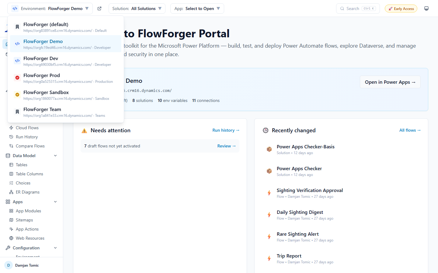 The environment selector dropdown listing available environments with type indicators
- Click the Environment dropdown to see all available environments.
- Each environment displays its name, Dataverse URL, and type (Production, Sandbox, Developer, Trial, or other).
- Environments are shown with a color-coded icon based on their type:
- Production -- Red icon
- Sandbox -- Yellow icon
- Developer -- Blue icon
- Trial -- Purple icon
- When the selected environment is a Production environment, the dropdown button has a red border and a PROD badge.
- The currently selected environment is highlighted.
- Click an environment to select it. This updates the Dataverse URL used for all API calls throughout the application.
- Next to the dropdown button, an external link icon opens the selected environment in the Power Apps maker portal.
Warning: If the page you are on has unsaved changes (for example, an open flow in the editor), switching environments asks for confirmation first, because the switch changes where your edits are saved.
Automatic behavior:
- On first load, FlowForger discovers your environments using the Power Platform API.
- If you previously selected an environment, it is restored.
- If no environment was previously selected, the first environment in the list is selected automatically.
- If environment discovery fails or returns no environments (for example, because the PowerApps Service permission is not granted), the header shows a warning with a Configure Manually button that takes you to Settings. Once you have entered an environment there, the header shows it as Manual Configuration, with a button to change it in Settings.
Tip: Your environment selection persists across sessions. You do not need to reselect it each time you visit FlowForger.
Solution Selector
The solution selector filters which solution's components you are viewing.
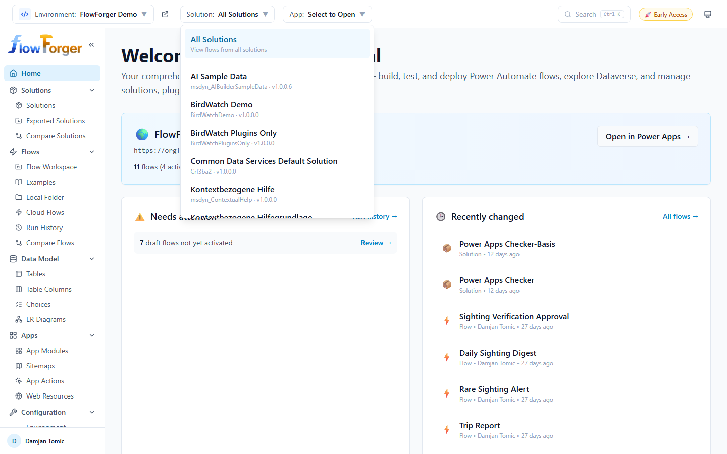 The solution selector dropdown showing the All Solutions option and available solutions
- Click the Solution dropdown to see all solutions in the selected environment.
- Choose All Solutions to view flows and components from all solutions.
- Or choose a specific solution to filter to only that solution's components.
- Each solution displays its friendly name, unique name, and version.
- The currently selected solution is highlighted.
- Next to the dropdown button, an external link icon opens the selected solution in the Power Apps maker portal (visible only when both an environment and a solution are selected).
The selected solution is also where new flows, components, and plugin steps are created on pages that support it.
Automatic behavior:
- Solutions are fetched when an environment is selected.
- If you previously selected a solution, it is restored.
- Your solution selection persists across sessions.
App Selector
The app selector provides quick access to model-driven apps and administration portals for the current environment.
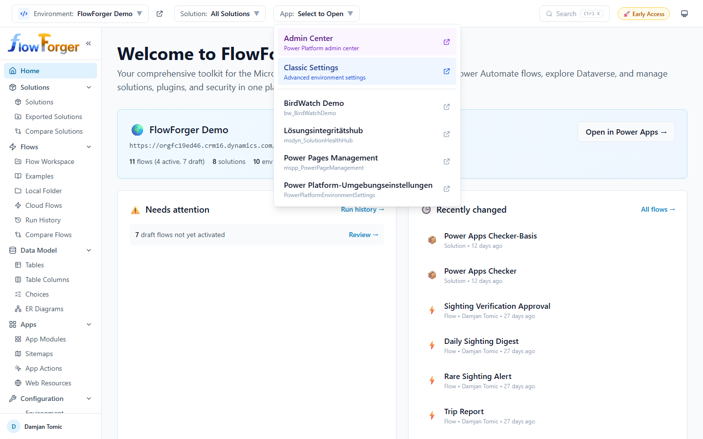 The app selector dropdown with admin links and model-driven applications
- Click the App dropdown to see available options.
- The dropdown always includes two special entries at the top:
- Admin Center -- Opens the Power Platform Admin Center for the selected environment (highlighted in purple).
- Classic Settings -- Opens the classic Dynamics 365 settings page for the selected environment (highlighted in blue).
- Below the separator, model-driven applications in the environment are listed. Each shows its name, unique name, and version.
- Clicking any entry opens it in a new browser tab.
Search, Early Access, and Theme
- Search (with the Ctrl K hint) opens the Command Palette.
- 🚀 Early Access -- FlowForger Portal is in early access; paid plans are planned but not live yet. Click the badge to open the Pricing page.
- Theme toggle -- Cycles between Light, Dark, and System (follows your operating system). The icon shows the current mode.
Sidebar Navigation
The sidebar is a vertical navigation panel on the left side of the application. It contains the FlowForger logo, navigation links organized into groups, and the user menu at the bottom.
 The sidebar navigation with collapsible groups and active page highlighting
Logo and Toggle
At the top of the sidebar, you see the FlowForger logo and a Collapse sidebar button (double chevron icon). When the sidebar is collapsed, the small FlowForger mark takes the logo's place; click it to expand the sidebar again.
Navigation Groups
The sidebar organizes navigation into the following sections.
Home (/home) is the first entry; Settings (/settings) is the last.
Solutions group (collapsible):
| Label | Destination |
|---|---|
| Solutions | /solutions |
| Exported Solutions | /exported-solutions |
| Compare Solutions | /compare-solutions (metered on the free tier) |
Flows group (collapsible):
| Label | Destination |
|---|---|
| Flow Workspace | /workspace |
| Examples | /examples |
| Local Folder | /local |
| Cloud Flows | /flows |
| Run History | /run-history |
| Compare Flows | /compare |
Data Model group (collapsible):
| Label | Destination |
|---|---|
| Tables | /tables |
| Table Columns | /table-columns |
| Choices | /option-sets |
| ER Diagrams | /erd |
Apps group (collapsible):
| Label | Destination |
|---|---|
| App Modules | /app-modules |
| Sitemaps | /sitemaps |
| App Actions | /app-actions |
| Web Resources | /web-resources |
Configuration group (collapsible):
| Label | Destination |
|---|---|
| Environment Variables | /env-vars |
| Connection References | /connection-refs |
Plugins group (collapsible):
| Label | Destination |
|---|---|
| Plugin Assemblies | /plugins |
| Plugin Types | /plugin-steps |
| Plugin Trace Logs | /plugin-trace-logs |
| Custom APIs | /custom-apis |
Users & Security group (collapsible):
| Label | Destination |
|---|---|
| Security Roles | /security-roles |
| Compare Roles | /compare-roles |
| Table Access | /table-permissions |
| Business Units | /business-units |
| Users | /users |
| Teams | /teams |
SharePoint group (collapsible):
| Label | Destination |
|---|---|
| Lists Browser | /sp-lists |
| File Identifiers | /sp-files |
Consoles group (collapsible):
| Label | Destination |
|---|---|
| FetchXML Query | /fetchxml |
| SQL Query | /sql |
| SP REST Console | /sp-rest |
| SP SQL Query | /sp-sql |
Expanding and Collapsing Groups
- Click on a group header to expand or collapse it.
- A chevron arrow next to the group name rotates to indicate whether the group is expanded.
- When a child page within a group is active, the group header is highlighted.
- Group expansion states are remembered across sessions.
- By default, all groups start expanded.
Active Page Highlighting
- The currently active page is highlighted with a blue background and bold text.
- Detail pages keep their list page highlighted (for example, a flow opened from Cloud Flows keeps Cloud Flows highlighted).
- If the active page is inside a group, the group header is also highlighted.
Collapsed Sidebar
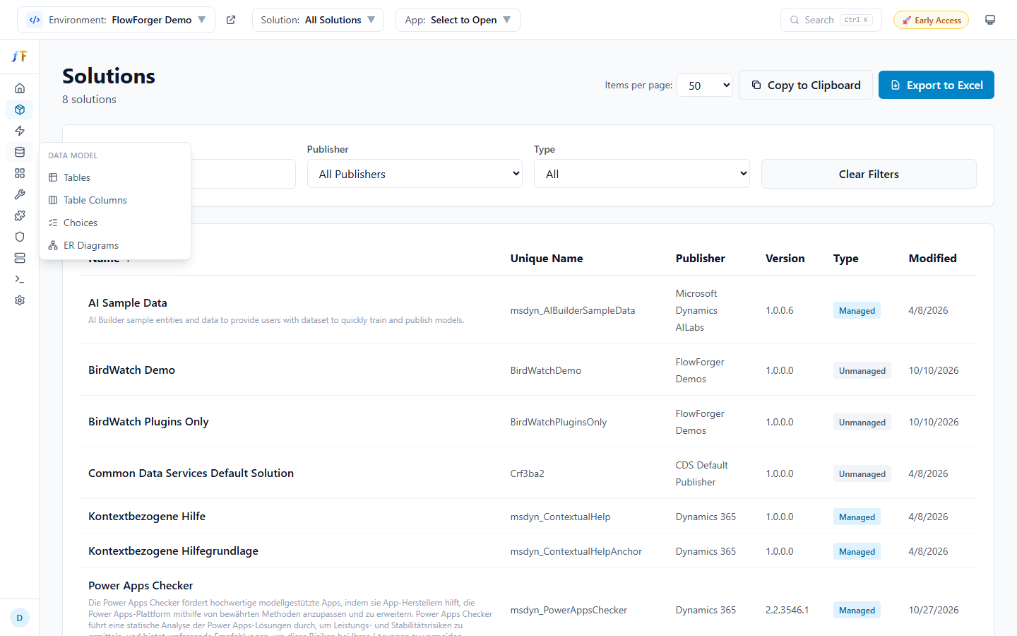 The sidebar in its collapsed state, with the flyout of a group open
- When collapsed, the sidebar shrinks to a narrow rail of icons: one per group, plus Home and Settings.
- Hover over a group icon to open a flyout listing the group name and its pages with their labels. Click a page in the flyout to open it.
- Hover over Home or Settings to see its name as a tooltip.
- Click the FlowForger mark at the top to expand the sidebar back to full width.
- The collapsed state is remembered across sessions.
User Menu
The user menu appears at the bottom of the sidebar, below the navigation links.
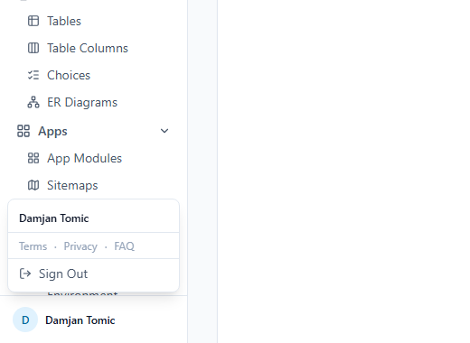 The user menu showing the signed-in user's name, email, and sign-out option
Click the avatar to open a popup menu showing:
- Your identity -- normally your signed-in name or email. If you are signed in through the browser extension and also have a separate FlowForger Portal account, both are shown, labeled FF: (FlowForger Portal account) and MS: (Microsoft 365 session).
- A Create FlowForger Portal account → link, shown when you are signed in through the browser extension. It opens Settings, where you can create an account with your email address (see Getting Started).
- Quick links to Terms, Privacy, and FAQ
- A Sign Out button (hidden when your session comes from the browser extension, since the extension manages it)
When the sidebar is collapsed, the same menu is available by clicking the avatar, which appears on its own without the name next to it.
Production Environment Indicator
When the currently selected environment is a Production environment, a thin red strip appears across the very top of the app, above the header, and the environment dropdown shows a PROD badge -- an always-visible signal that you are working against production data.
Command Palette
Press Ctrl+K (or Cmd+K on macOS) anywhere in the app, or click Search in the header, to open the Command Palette, a searchable quick-navigation overlay.
- Type to search across every sidebar page, plus your environment's flows, solutions, and tables by name. Flows, solutions, and tables are searched only when an environment is selected.
- Results show a sublabel for context (e.g., the nav group a page belongs to, or a flow's status).
- Use the ↑ / ↓ arrow keys to move between results and Enter to open the selected one, or Escape to close the palette.
Page Help
Some pages (for example Cloud Flows, Local Folder, and the Flow Editor) have a round ? button next to the page title. Click it to open a help panel on the right that describes the page, what you can do there, and tips. Press Escape or click the close button to hide it.
Comparison Tray
When you pin a flow for comparison (from an Add to Compare action on a flow row, or Compare with... in the Flow Editor), a tray docks to the bottom of the screen showing up to two pinned flow slots, a Clear button, and a Compare button that becomes active once both slots are filled. The tray persists across page navigation and browser sessions until cleared. See Compare Tools for the comparison views this feeds into.
Home Dashboard
The home page (/home) is the main dashboard after signing in. It shows an overview of your current environment, flows and solutions that need attention, and what's changed recently.
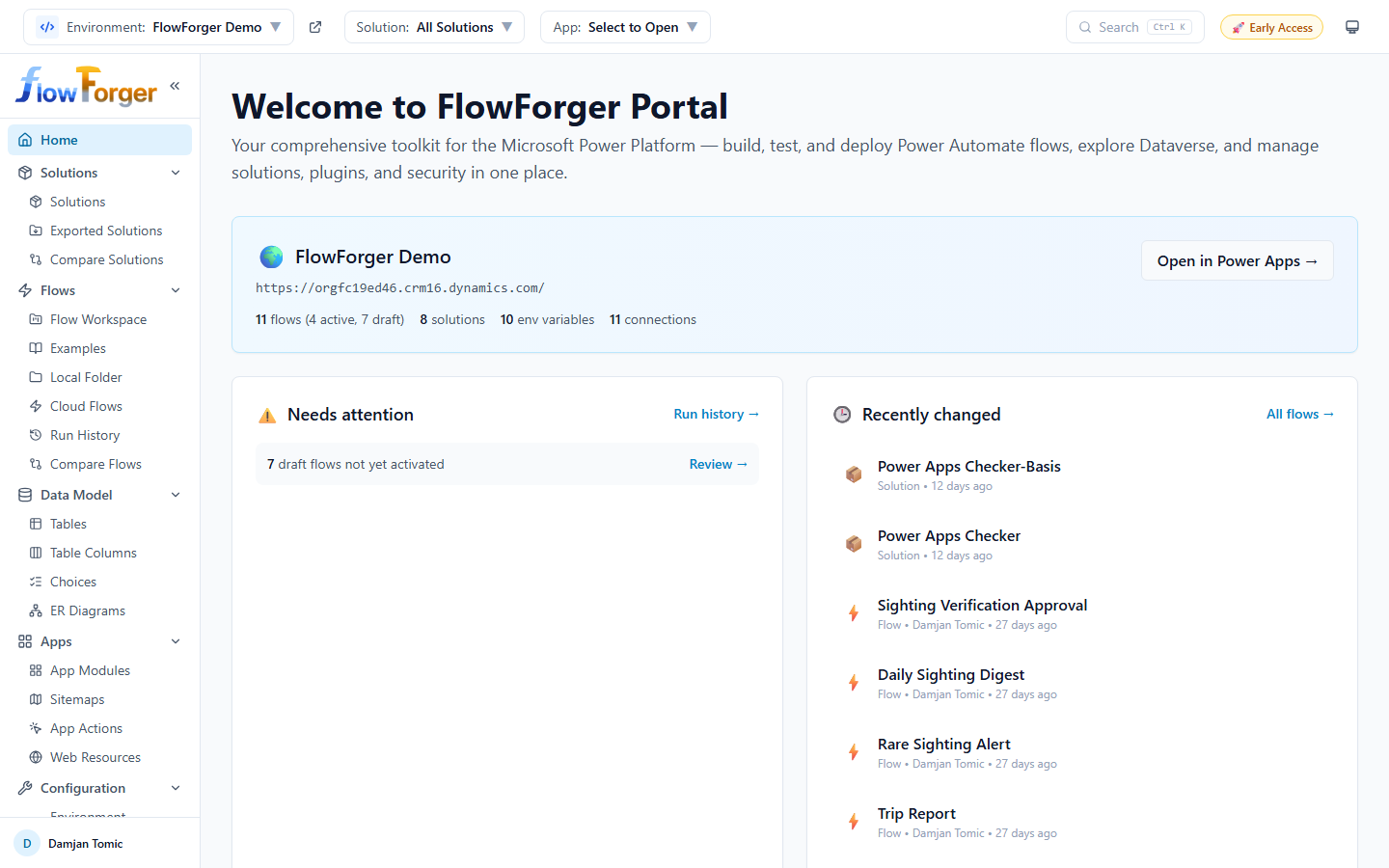 The home dashboard showing the environment overview banner, needs-attention panel, and recently-changed panel
Environment Overview Banner
At the top of the dashboard, a banner displays information about the currently selected environment:
- Environment name and Dataverse URL
- Summary statistics: number of flows (with active/draft counts), solutions, env variables, and connections
- An Open in Power Apps button that opens the environment in the Power Apps maker portal in a new tab
If no environment is selected, a No Environment Selected warning appears instead, prompting you to select one from the header dropdown.
Needs Attention
Below the environment banner (shown only when an environment is selected), the Needs attention panel surfaces things worth checking:
- A count of draft flows not yet activated, with a Review link to Cloud Flows.
- Recent failed runs across the whole environment (up to 5), each showing the flow name, how long ago it ran, and the error message if available. Click a failure to jump to that flow's run history.
- If there are no draft flows and no recent failures, a "No failures in recent runs. All clear." message is shown instead.
- A Run history link in the panel header jumps to Environment Run History.
Recently Changed
Alongside Needs Attention, the Recently changed panel lists the most recently modified flows and solutions across the environment (up to 6), each showing its name, kind (Flow or Solution), who modified it, and how long ago. Click an entry to open it: a flow opens in the Flow Editor, a solution in its Solution Detail page. An All flows link jumps to Cloud Flows.
Quick Start Guide
If no environment is selected, a Quick Start guide appears with numbered steps:
- Select an environment from the header dropdown
- Browse your Solutions to see existing flows
- Use Test & Debug to build and test flows in one place
- Run flows locally using the editor's built-in runner before deploying